直感的で使いやすいサブスクリプション体験を通じて、ユーザーの信頼とブランドの独自性を築く
直感的で使いやすいサブスクリプション体験を通じて、ユーザーの信頼とブランドの独自性を築く
Wa! Organicは、日本発・海外向けの月額制オーガニック定期便サービスです。ユーザーは、最初に簡単なパーソナルクイズに答えることで、自分に最適なボックスの提案を受けられます。体験全体はシンプルでスムーズに設計されており、地元農家のストーリーを通じて信頼感を育みながら、日本のオーガニック製品の価値をより多くの人々に届けることを目指しています。
Wa! Organicは、日本発・海外向けの月額制オーガニック定期便サービスです。ユーザーは、最初に簡単なパーソナルクイズに答えることで、自分に最適なボックスの提案を受けられます。体験全体はシンプルでスムーズに設計されており、地元農家のストーリーを通じて信頼感を育みながら、日本のオーガニック製品の価値をより多くの人々に届けることを目指しています。
DURATION
DURATION
6 weeks
6 weeks
PRODUCT
PRODUCT
Mobile Website
Mobile Website
MY ROLE
MY ROLE
Researcher, UIUX Designer
Researcher, UIUX Designer
Goals
Goals
ブランドの差別化
商品のストーリーテリング
シームレスなショッピング体験
Research


Problem
Lack of Market Differentiation:
With many Japan-themed subscription boxes already on the market, clearly defining the brand positioning and unique value is a key challenge.
Turning Brand Values into Trust:
How can we effectively communicate producers’ stories in a way that builds trust and drives user action?
Reducing Decision Fatigue and Guiding Action:
How can we let users explore at their own pace while providing the right guidance to smoothly complete the subscription process?
Solution
Personalized Quiz
Finding Opportunities Through Competitor Analysis
Storytelling
A/B Testing to find the best storytelling approach.
Seamless Experience:
Reveal patterns and predict user interaction flows by Affinity Diagram
Research
Research
Solution 1
Personalized Quiz
Personalized Quiz
Finding Opportunities Through Competitor Analysis
Finding Opportunities Through Competitor Analysis
Competitor Analysis
Competitor Analysis

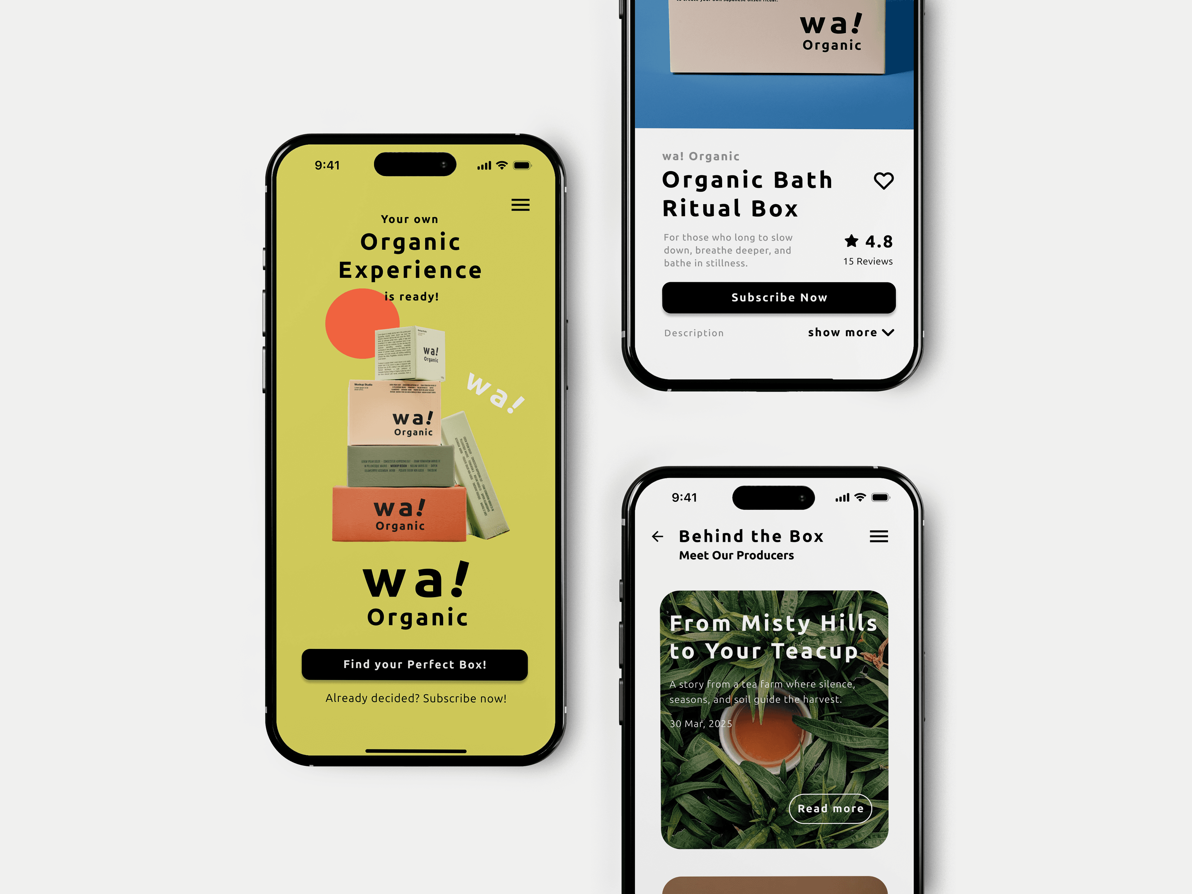
After comparing three leading Japanese subscription box brands, I noticed that there is no personalized interaction built into the experience.
So I introduced a personalized quiz as the starting point of the website, helping users feel more involved while building a unique brand experience.
After comparing three leading Japanese subscription box brands, I noticed that there is no personalized interaction built into the experience.
So I introduced a personalized quiz as the starting point of the website, helping users feel more involved while building a unique brand experience.

# 1st Round Test Result
# 1st Round Test Result
”
”
When the answer is selected, I can jump in the the next page without clicking “next”
When the answer is selected, I can jump in the the next page without clicking “next”
”
”
I’d like to know more about what’s in the matched box before choosing.
I’d like to know more about what’s in the matched box before choosing.
Less Clicking, More Clarity:
Design Improvements Based on User Input
Less Clicking, More Clarity: Design Improvements Based on User Input
Solution #1
Solution #1
To reduce the mental effort of repeated clicking, we redesigned the quiz so that it automatically moves to the next question after each selection.
To reduce the mental effort of repeated clicking, we redesigned the quiz so that it automatically moves to the next question after each selection.
Solution #2
Solution #2
Added a short “for those who...” part to help users quickly connect with the result. When users click on a box or its description, they can see more details.
Added a short “for those who...” part to help users quickly connect with the result. When users click on a box or its description, they can see more details.
Solution 2
Storytelling
Storytelling
Farmer stories & A/B Testing to find the best storytelling approach.
Farmer stories & A/B Testing to find the best storytelling approach.
Approach 1
Approach 1
Farmer Quotes on the Box Listing Page
Farmer Quotes on the Box Listing Page
Farmer Quotes on the Box Listing Page
Short quotes from the farmers that give each product a personal voice and help users feel more connected to the people behind it.
Short quotes from the farmers that give each product a personal voice and help users feel more connected to the people behind it.
”
”
The brand introduction below the box isn't very noticeable. and I don't really understand the purpose or benefit of scrolling down.
The brand introduction below the box isn't very noticeable. and I don't really understand the purpose or benefit of scrolling down.
Based on user feedback, we added a related section after the product overview. However, the impact was limited.
To find the most suitable content, I proposed two versions and validated through A/B testing.
Based on user feedback, we added a related section after the product overview. However, the impact was limited.
To find the most suitable content, I proposed two versions and validated through A/B testing.
Version A

”
”
It feels too repetitive as I scroll down, it's still all box visuals
It feels too repetitive as I scroll down, it's still all box visuals
It feels too repetitive as I scroll down, it's still all box visuals
Quotes from the makers
Quotes from the makers
Repetitive Visual
Repetitive Visual
Version B

Theme slogans and visual imagery to evoke emotional connection and strengthen brand identity.
Theme slogans and visual imagery to evoke emotional connection and strengthen brand identity.
Contents-related Visuals
Contents-related Visuals
The wording is too vague.
The wording is too vague.
Not much to gain by scrolling further.
Not much to gain by scrolling further.
Version B
Theme slogans and visual imagery to evoke emotional connection and strengthen brand identity.
Contents-related Visuals
The wording is too vague.
Not much to gain by scrolling further.
Final Version
Makers’ Voice
Makers’ Voice
Adding farmer or producer names to build trust
Adding farmer or producer names to build trust
Contents-related Visuals
Contents-related Visuals
We combined the best parts of test versions A and B, and added the farmer’s name and farm name section to build trust. Beyond the farmer articles, these small highlights help reinforce user recall of each farmer.
We combined the best parts of test versions A and B, and added the farmer’s name and farm name section to build trust. Beyond the farmer articles, these small highlights help reinforce user recall of each farmer.
Approach 2
Farmer Stories Sections
Farmer Stories Sections
Tell the story behind each farm through in-depth articles.
Tell the story behind each farm through in-depth articles.
Approach 2
The stories behind the products are presented as interviews, aiming to strengthen the connection between users and the products.
Each article ends with a button linking to a box featuring items from that farmer, encouraging purchase intent.
The stories behind the products are presented as interviews, aiming to strengthen the connection between users and the products.
Each article ends with a button linking to a box featuring items from that farmer, encouraging purchase intent.
Solution 3
Seamless & Shopping Experience
Seamless & Shopping Experience
Predicting users’ core tasks and needs through affinity diagram
Predicting users’ core tasks and needs through affinity diagram
Mapping user needs helped define structure and flow.
Mapping user needs helped define structure and flow.
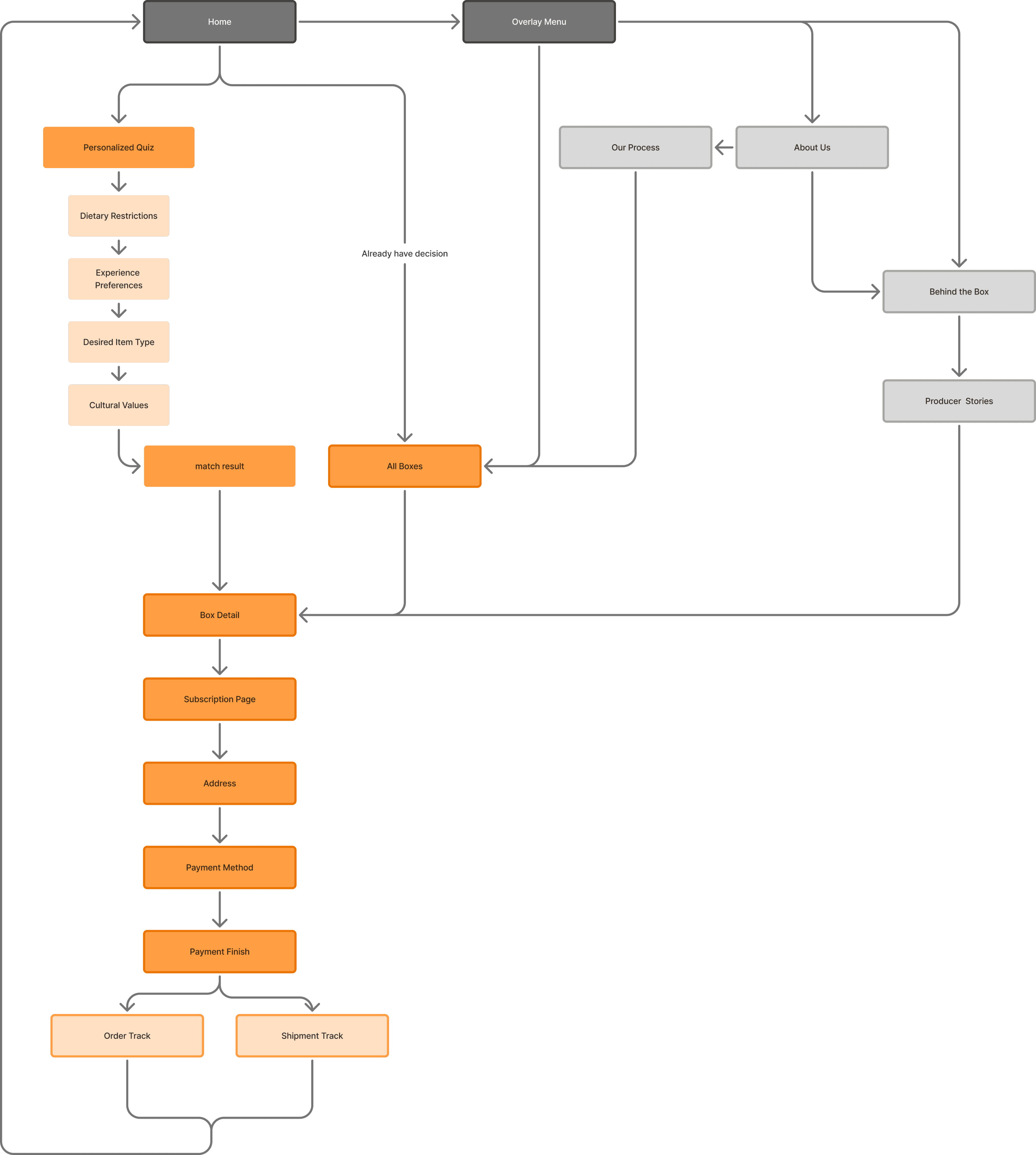
I used an affinity diagram to uncover users' key needs during exploration and subscription. This helped shape the information hierarchy and guided the site map and flow, aligning the layout with real user behavior.
I used an affinity diagram to uncover users' key needs during exploration and subscription. This helped shape the information hierarchy and guided the site map and flow, aligning the layout with real user behavior.
Approach 1

Approach 1
Approach 1
One-Page Payment Information
One-Page Payment Information
Simplified Steps for a Frictionless Experience
Simplified Steps for a Frictionless Experience
To make checkout easier and faster, I used a single-page layout with expandable dropdowns for payment options. This helps reduce user effort and keeps the process smooth and clear.
To make checkout easier and faster, I used a single-page layout with expandable dropdowns for payment options. This helps reduce user effort and keeps the process smooth and clear.
Conclusion
Final User Testing & Learning
Final User Testing & Learning
Conclusion
User Insight #1
User Insight #1
Usability Test Results Summary
Usability Test Results Summary
Based on a survey conducted with over 20 users, we gathered the following results:
Based on a survey conducted with over 20 users, we gathered the following results:
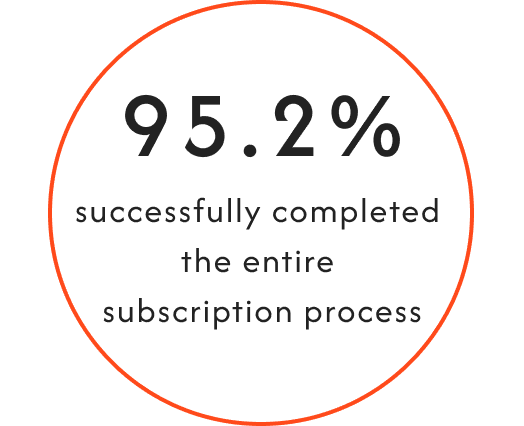

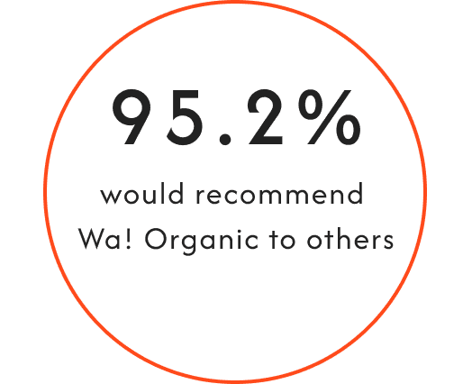
These results demonstrate that the updated user flow not only improved task completion but also enhanced overall user confidence and brand trust. The clarity of the interface and the guided steps played a key role in reducing friction and boosting recommendation intent.
These results demonstrate that the updated user flow not only improved task completion but also enhanced overall user confidence and brand trust. The clarity of the interface and the guided steps played a key role in reducing friction and boosting recommendation intent.
User Insight #2
User Insight #2
Usability Overall Feedback
Usability Overall Feedback
”
”
I love the visual design, and the flow was really smooth.
I love the visual design, and the flow was really smooth.
I love the visual design, and the flow was really smooth.
”
”
Crystal clear instructions. great job!
Crystal clear instructions. great job!
Crystal clear instructions. great job!
”
”
the animation are cute and the UI looks clean.
the animation are cute and the UI looks clean.
the animation are cute and the UI looks clean.
”
”
The overall process was very smooth. The visual was Simple and easy to understand. The design was fun to see too !
The overall process was very smooth. The visual was Simple and easy to understand. The design was fun to see too !
The overall process was very smooth. The visual was Simple and easy to understand. The design was fun to see too !
Learning
Learning
In addition to learning UX research methods such as competitor analysis and affinity diagrams, I realized during the optimization process that helping more users understand the product requires more than conveying abstract scenarios or vague brand messages. What users truly need is clear, specific, and trustworthy information. These details are what genuinely influence their decision-making.
In addition to learning UX research methods such as competitor analysis and affinity diagrams, I realized during the optimization process that helping more users understand the product requires more than conveying abstract scenarios or vague brand messages. What users truly need is clear, specific, and trustworthy information. These details are what genuinely influence their decision-making.
Scrroll to Top
Scrroll to Top
Scrroll to Top
